Insights
For most non-government websites, adoption of current accessibility standards isn’t technically law. What does this mean? You don’t have to make your website accessible. It’s entirely up to you. Even so, it’s a standard part of our design process at Br8kthru and we recommend meeting web accessibility guidelines as a goal for any website or web app project. We don’t view an accessible web as a burden, but as an opportunity to be truly user-centered in our design thinking. Keep reading for three key reasons to begin projects with accessibility in mind.
Designing for Accessibility is User-Centered Design

The biggest trend in digital marketing over the past few years isn’t from Google, Facebook, or a tech gadget. It’s a focus on human beings. Content strategy, paid media, and user-centered design all work best when tailored to the end user, a person. Going beyond generic personas and anonymous data collection, designing with accessibility in mind layers an additional human element to the process. Not every user, even in a tightly defined buyer persona, is the same. User-centered design becomes more effective, not more restricted, with accessible design standards.
Things that appear inconsequential to some might make an entire site unusable for others. Color contrasts, font sizes, and video captions are just a few things that can make all the difference for users. Accessible design doesn’t have to be complicated or difficult, and you don't need a complicated or custom website (Wordpress and Squarespace both support accessibility). It just has to be inclusive and good for the user.
SEO and Accessibility Can Coexist
Search engine optimization (SEO) is a lot of things. But at its core, it’s the process of making web content visible to search engines, i.e., making Google happy. Google is decidedly not human, so are user-centered design and accessibility standards at odds with SEO? Absolutely not. In fact, SEO and accessible design often overlap in goals and tactics. The same HTML heading tags an SEO uses to signal a page’s topic and structure are the same tags a screen reader will use to provide someone with low-vision context. Write clear headings and avoid using tags for styling.
Similar to HTML tags, alt text for images are used by both SEOs and accessibility tools. Avoid keyword stuffing (a good rule regardless of accessibility) and clearly describe images in the alt text, rather than copy and paste a file name or irrelevant phrase. A nice side-effect is that you'll begin to notice when you’re using images for the sake of using images instead of designing with context.

Accessible Websites are Good. And Good for Business
The main reason to include an accessibility check in a design process, of course, is that it’s the ethical choice. Inclusion over exclusion. If you needed more reasons, it’s also a smart business move. The guidelines, like including relevant alt-text, structuring a page logically, and using viewable text on CTAs, actually help to keep a site on-message and clear to all users. And by ensuring accessibility, you’re greatly expanding your reach to a group your competitors may be shut off from. A huge win in any industry.
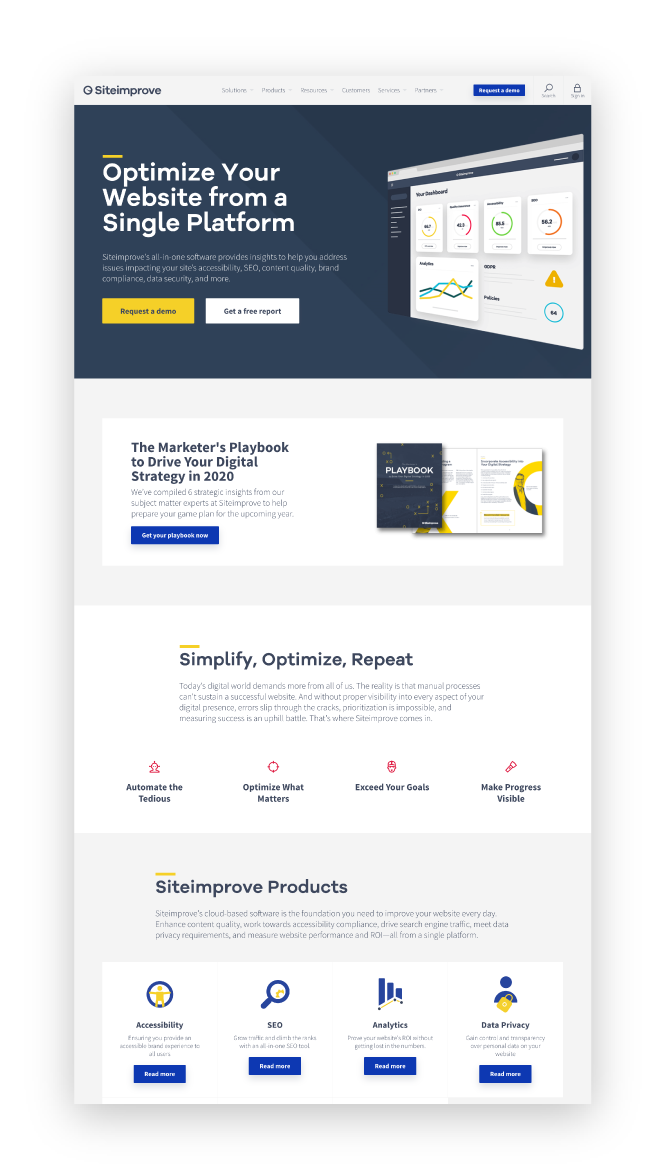
Understandably, more complex websites have a bigger lift to reach accessibility standards and the cost/benefit can shift depending on your business case. The good news is, it doesn’t all have to happen overnight. Use tools like SiteImprove or WCAG color contrast tool to monitor deficiencies and improve over time.
With the positive impact on users, SEO, and reach, it just makes sense to go beyond standard design thinking with a user-centered, accessible, approach. Reach out before your next project. Our Design Team would love to dive deeper into their process of designing for an accessible web.